Payoff Analysis Chart
The Payoff Analysis Chart displays as a result of using the Options Price Calculator / Strategy Builder.
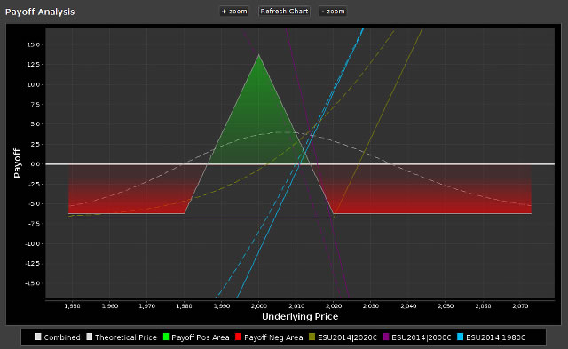
Tips for Using the Payoff Analysis Chart
The payoff analysis chart has buttons at the top that allow you to + zoom zoom in and - zoom zoom out. You cay also update the chart with current market data by using the Refresh Chart button.
The break-even point is shown as a solid white horizontal line with the current underlying price centered on the horizontal axis (x-axis). The following figure, from the Options Industry Council's website, shows different options strategies and their typical profit and loss diagrams.

Other tips for using the chart:
- You may also use your mouse wheel to zoom in or out on the chart.
- You can show or hide any of the plotted graph lines on the chart by clicking on the colored squares in the chart legend:
